

Busan Gupo Traditional Market
-
Concept and Background
With the development of the Korean economy, the economic power of traditional markets has been becoming weaker. There is a stereotype about Korean traditional markets that all goods that are sold in the market are unorganized and unsanitary. People have been started to shop at different places such as department stores and modern supermarkets. I felt a strong sense of responsibility to revive the nostalgic place, and to protect the function of traditional markets. Naturally, my interests led me to start to do research on the traditional market, and I chose Gupo traditional market in Busan, South Korea which has a history of 42 years.
While I was walking around the market, I noticed some problems. The signs are pretty well organized because they were newly systematized a couple of years ago by replacing old signs to new ones. However, noticeably, the market does not have a logo image which can represent its identity. In the case of map design, it was not aesthetically pleasing.
Through my new attempt to introduce sustainable branding to the traditional market, I believe that young people would see a different perspective of the goods that are sold in the market. I hope we will not lose our historically valuable and nostalgic space in Korea.

Packaging Design for Gupo Market (Exhibited in Busan Cinema Center in Busan, Korea, 2014)


To convey the farmers' effort and their sweat, an illustration was made with pencil and pen. (16.53in"x33.07in", 2014)
Illustrated for the identity for the market


The Final Results :
The union of the symbol and the typography.
Market Identity


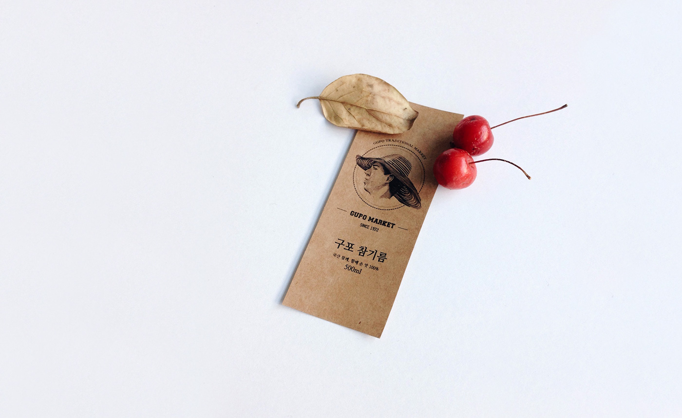
Packaging Label for sesame oil bottle (1.96in"x3.54in")
P A T T E R N S


Packaging Label for sesame oil bottle
The aim behind the development of the packaging design was to differentiate this sesame oil from similar ones on the market. The eye-catching hand drawn label design represents the handcrafted manufacturing process of the product. An additional bottle cap label wrap furthermore emphasizes the vintage and sophisticated high quality style of the product.
The aim behind the development of the packaging design was to differentiate this sesame oil from similar ones on the market. The eye-catching hand drawn label design represents the handcrafted manufacturing process of the product. An additional bottle cap label wrap furthermore emphasizes the vintage and sophisticated high quality style of the product.


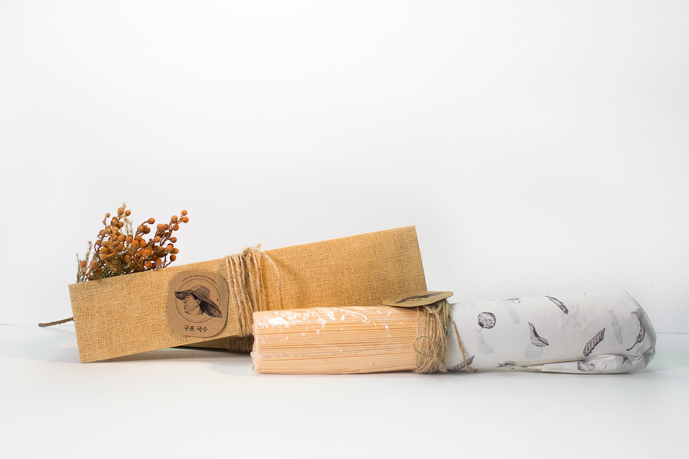
Noodle Package
Gupo Market is known for its Gupo noodles; however there are no logos for their famous noodle shops and designer product packages as well. And also, most traditional market noodle shops in Korea have a somber and dark impression because of their out-dated interior designs. When I considered how I could make the interior display of the noodle shops brighter with only a small budget, I selected a vivid noodle package color that stimulated one’s appetite, thus captivating the attention of the target group. The reason why I designed the shape of the package triangular is because it would make stacking convenient and that would make better use of the shelf space.
Gupo Market is known for its Gupo noodles; however there are no logos for their famous noodle shops and designer product packages as well. And also, most traditional market noodle shops in Korea have a somber and dark impression because of their out-dated interior designs. When I considered how I could make the interior display of the noodle shops brighter with only a small budget, I selected a vivid noodle package color that stimulated one’s appetite, thus captivating the attention of the target group. The reason why I designed the shape of the package triangular is because it would make stacking convenient and that would make better use of the shelf space.

Structural Design of Noodle Package (5.11in"x10.23in")


More information here : http://www.heesungkim.com/gupo-traditionalmarket.html


